NÉBIH
Frontend and user experience
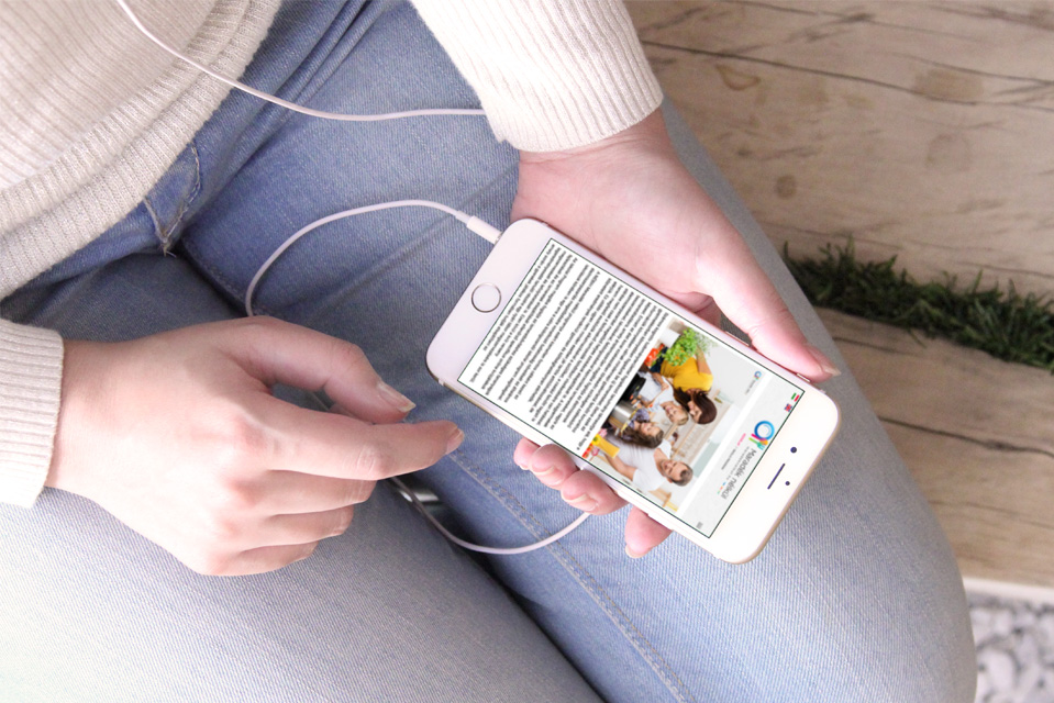
Our task was to provide expert support for Nébih's mobile app, from finding its name (Nébih Navigátor) all the way to building the app's frontend: defining the visual strategy, extending the brand identity specifically for the mobile app, and creating the individual graphic elements, navigation, and iconography.
Google Play
iTunes
STABILO
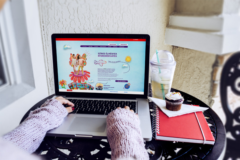
When building the microsite for the “I Color with Stabilo” drawing contest, our top priority was making the site's features easy and intuitive to use. The responsive web design we created blended perfectly with the hand-drawn graphic elements and the “Mobile-Friendly” frontend. We built the graphic elements by modeling the exact user journey, preserving the site's playful look while helping users navigate it with ease.
FORD
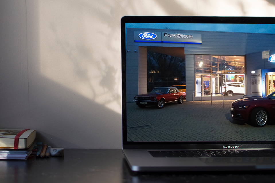
Ford.hu mobile view
Our task was the responsive design of the Ford.hu website's mobile pages: creating an entirely new mobile experience while preserving the functionality of the existing central site. We were commissioned to review the site's complete information architecture, provide related consulting, and then design the wireframes and layouts for the mobile pages.